Poster Design Idea for Mid-Sure
MidSURE provides an opportunity for students involved in research and creative activities at Michigan State and other institutions in Michigan to share their work with their peers and the MSU community.
With this design I aimed to visually capture the moment just before "Mid" and "Sure" intersect, symbolizing the convergence of colleges from across Michigan for this event. I chose pink and green for the typographical and visual elements because they stand out boldly against the black background, creating a vibrant look that does not align with any specific school’s branding. The individual shapes throughout the composition represent the diverse components that make up both the research and the program itself. I selected a structured and legible typeface to reflect the precision that is essential for successful research. Finally, by partially cropping the title, I wanted to suggest that there's more beneath the surface of MidSUR and hint at the depth of the work students showcase.


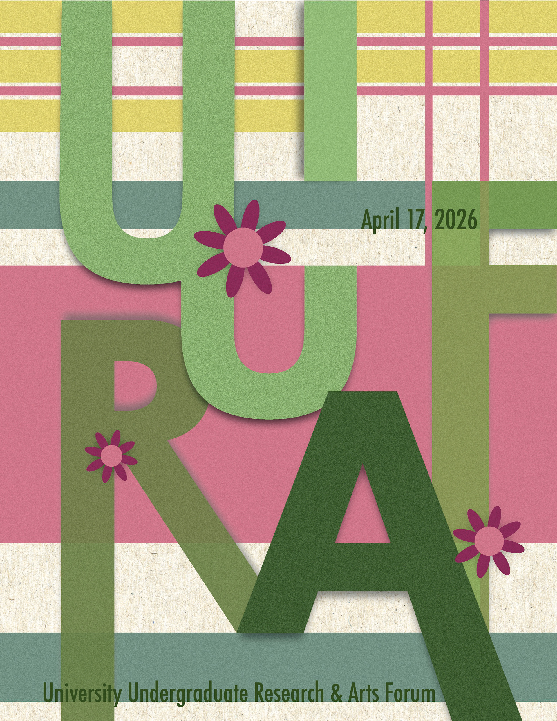
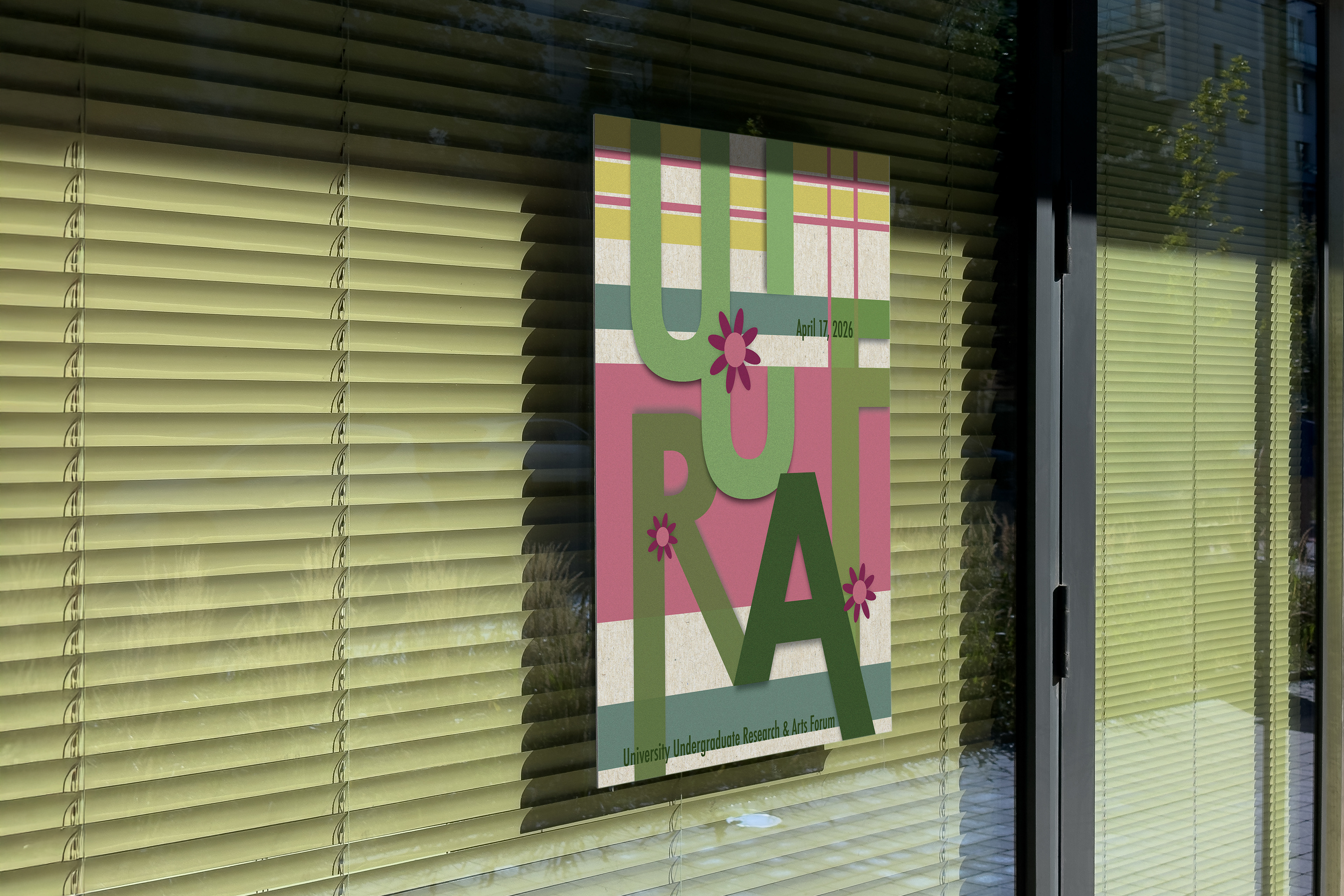
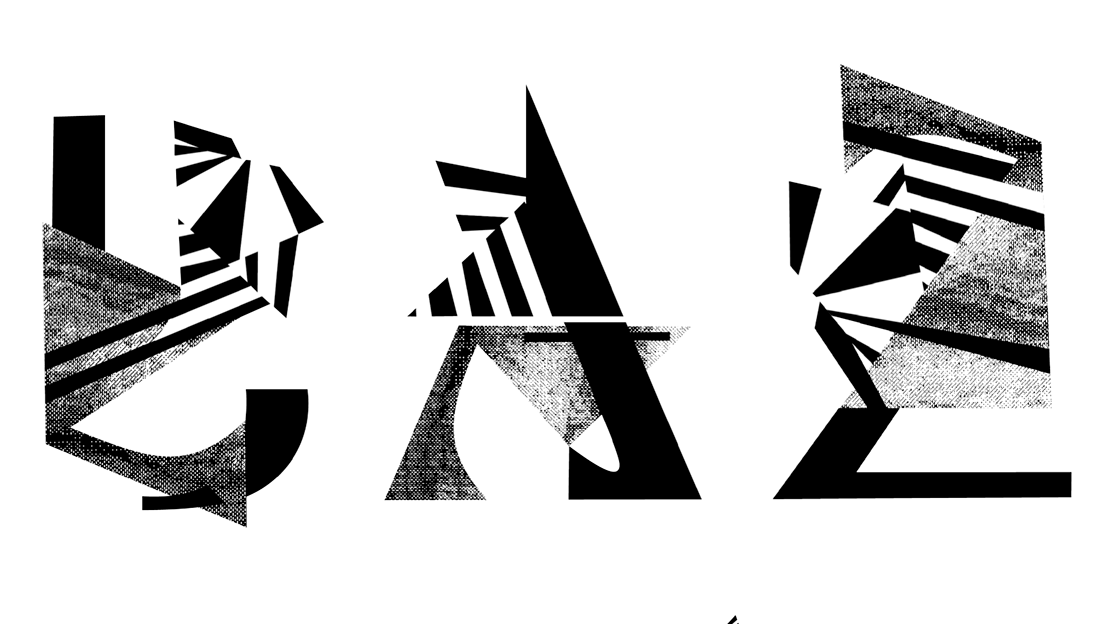
Poster Design Idea for UURAF
UURAF provides Michigan State undergraduate students with an opportunity to showcase their scholarship and creative activity. Held each spring, UURAF brings together an intellectual community of undergraduate students to share their work with faculty, staff, peers, and external audiences. Participants will gain experience in presenting their research, answer questions about their work from audience members and guests, and receive constructive feedback from judges.
For this design I wanted to highlight the fact that UURAF takes place during the spring. Spring often represents growth, renewal, and blooming, which parallels with the development of research and creative work. I used green to honor MSU’s identity, and added complementary colors like pink, blue, and yellow to create a complimentary color palette. To reinforce the idea of growth, I incorporated flowers emerging from the letterforms. The typeface for these letterforms being Futura due to its clarity and the complexity of the layout. I wanted to ensure that “UURAF” remained bold and legible. Finally, the layered textures and shadows give the piece a collage-like quality, making the piece feel dynamic and handcrafted rather than flat or digital.